Agatha App Redesign.
Redesign of an mvp App scratch until a brand new Design System and Accessibility Guidelines.

The concept.
For the Agatha app redesign, we started doing some research inside and outside the company to better understand the current situation and where we want to go. We mapped the current structure of the app and how far the redesign would change it.
Once it was clear the project scope, I started the colors and visual pattern studies following the branding.
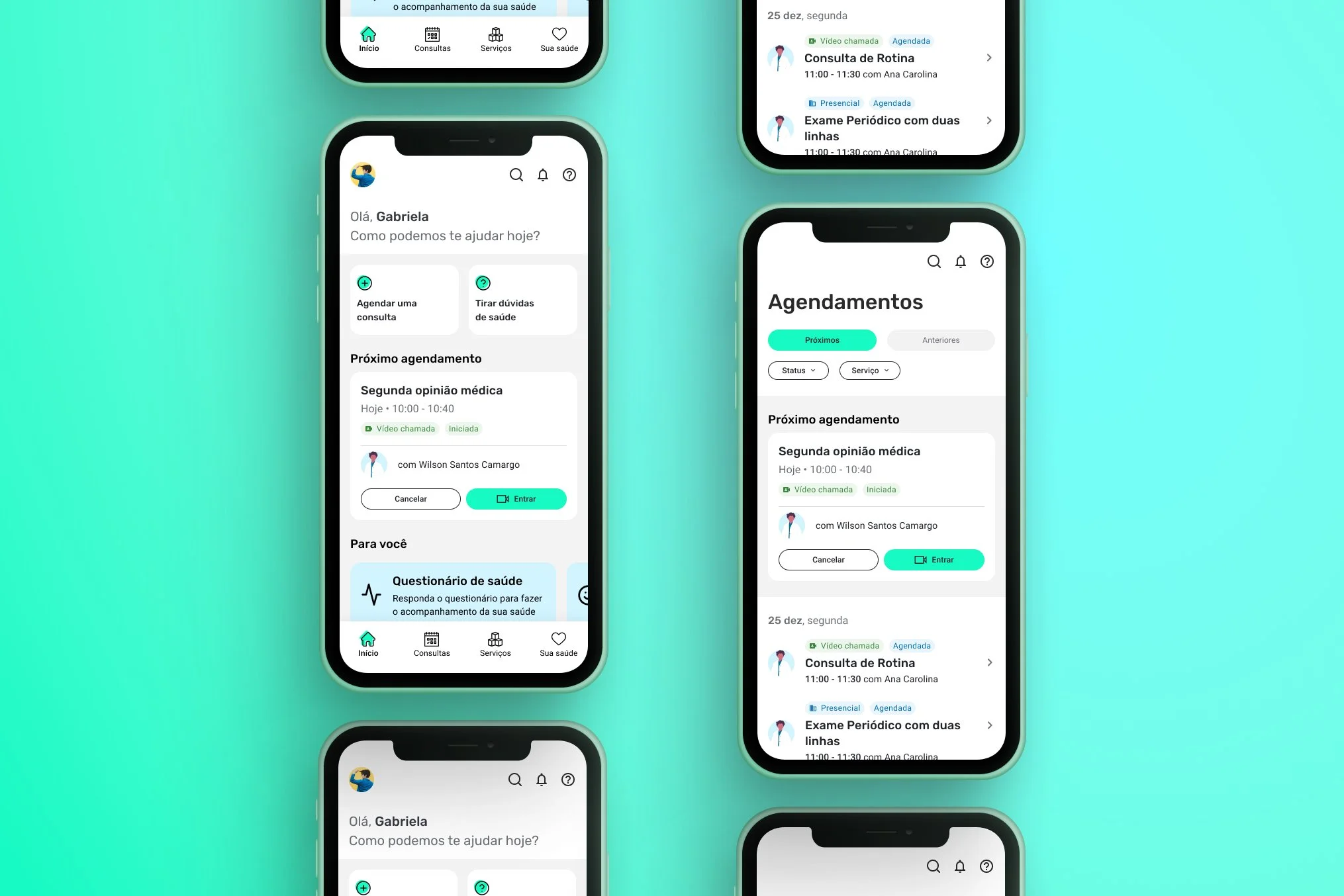
Prototyping.
Based on the wireframe, I was able to start working with prototypes in high fidelity. The colours followed the branding (with minor changes) and the iconography was worked in rounded and minimalist shapes to simplify the layout and have fast understanding. All contents were written in order to approach the patient to the Agatha in a conversational structure.
About accessibility, all texts and colours were revised to be accessible, and I created a specification document for the screen reader, ensuring that all the elements will also be developed in an accessible way. In addition, I included more interactions in the app to bring more fluidity and lightness.